Another new update is out today and we think it’s worth kicking up a bit of a fuss.
This update is the first stage of changes to our Jobs page that’s preparing you for some awesome features that aren’t far away. This is the first-taste of things and we wanted to let you dip your toe in and ease you into things 🙂
A clearer picture
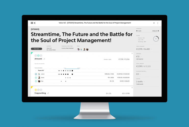
Your new Job screen displays all of your items as usual but without any additional jargon. We have removed the statuses and replaced them with easy to understand symbols.

We’ve also brought in a side-panel with a summary of what’s happened on the job so far. It splits out your job detail to show you a more in-depth view of quicker that compares everything at a glance.
This view also shows the introduction of the colour wheel that shows you your planned, started or done items in a nice clear visual. Within the inner ring it shows the progress of used time so you can compare it with the stages of your Items.

Time, Tasks and To Do’s
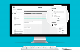
We have made a few tweaks inside your To Do’s and the Team Schedule in preparation for the next round of changes.
The To Do’s now show the time on tasks differently. This information is available when you’re hovering over a To Do. You’ll clearly see Task (time of this task), Total (time scheduled in your To Do’s linked to this item) and Remaining/Over (The time left or over on the Item against Done to do’s).

Our intension is to be very clear about what you have To do against what was planned.
We also created this short clip to help explain things if you have a spare 2 min 🙂
https://vimeo.com/194306575
If you have any feedback or questions please give us a shout.


