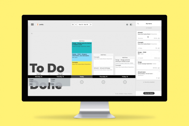
Streamtime’s To Do page is heavily used, and loved by a huge percentage of people looking to log time painlessly. The sidebar, however, was a different story.
We spoke to and received plenty of comments from many of you and agreed it needed improving. It wasn’t working hard enough to help you locate items or understand which items you should be focusing on.
Our design team went back to the drawing board, collated all the comments, and dived into the problem with the goal of making it better. Here’s some insight into what we found and how we went about improving it.
Assumptions
- People refrain from clicking the ‘complete’ button out of fear of the unknown. ‘What is it going to do? Will it ever come back? Does it complete it for everybody on the item?’
- Including ‘What I’ve been working on recently’ into the order/priority of the sidebar will make it more relevant and useful
- Search is useful when searching for a particular item or an item you’re not currently assigned to
Goals
- Help people stay focused on the items that are important to them right now
- Help people understand what they should be working on next
- Allow people to de-clutter their list without having to commit to completing items
- Allow people to search and easily add themselves to any item
The sidebar wasn’t working hard enough to help you locate items or understand which items you should be focusing on.
What we’ve done about it:
Snoozing

You can now snooze items that don’t need your attention just yet.
- Forever – Item stays in Snooze indefinitely
- Custom – Item stays in Snooze until a set date
- A week before due – Item stays in Snooze until a week before the due date
- Start date – Item stays in Snooze until the item start date
Search

You can now search through all items (including those you’re not assigned to) by:
- Item description
- Job name
- Job number
- Company / client
Recently worked on items
Items in your To Do list for or next 7 days will rise to the top for quick access and added focus.
Recently completed items
Completed items now appear at the very bottom of the list, and are visible for 7 days only, reducing clutter.
What does it all mean?
A smarter sidebar that works harder to surface the most relevant items for you. Finally, a more worthy partner for your hardworking To Do page!


